
So I got bored and decided to create a Japanese album for I-DLE. I am not a design student, but I did try my best. This was for fun anyway.
I envisioned this album to be loud, colourful, and visually compressed.
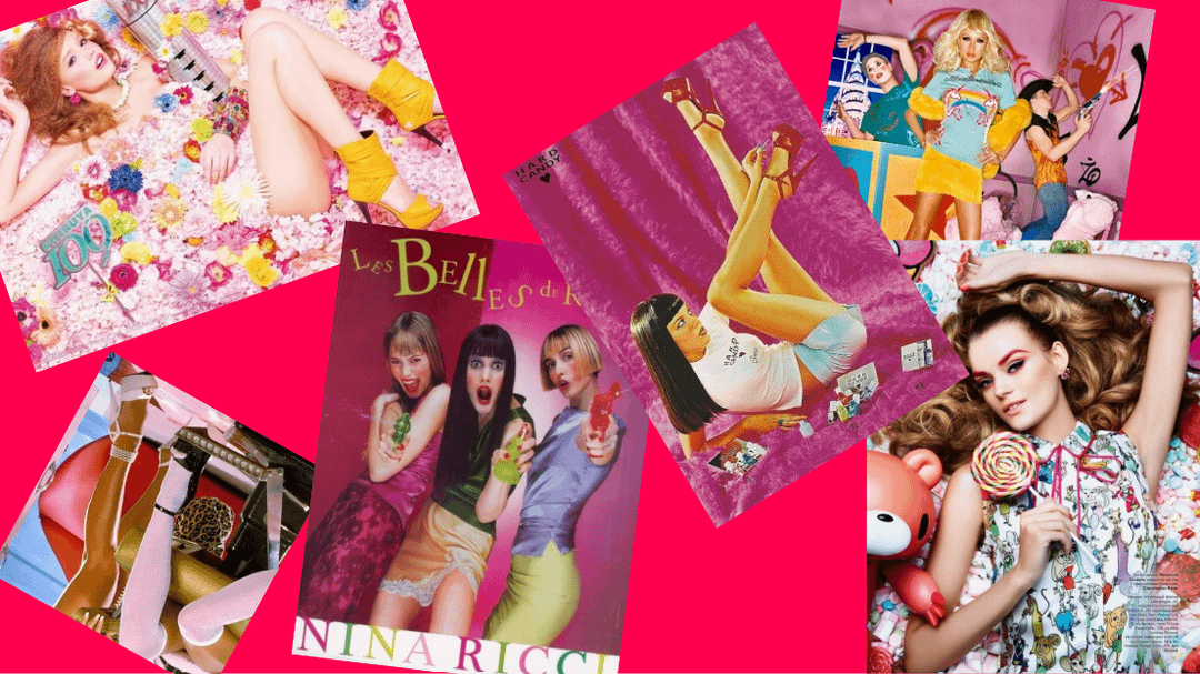
Slide one: Concept
-
Candy is the main symbol used within the visuals of the album, but also throughout the songs. It first creates this picture of innocence and sweetness that the listener will go in expecting a pop album, but this is more than that; this album comes from a personal and possibly political point of view about adulthood and being a woman.
-
The looks include short skirts, stockings, but not in an absurd way; when you look at the styling, it just fits and looks right. However, you don’t pay attention to the article of clothing but more to the pop of colour, interesting use of accessories, hair style and fabrics that create an entire new world, perspective and event that leaves your brain preoccupied.
Track list: (Disclaimer, this is again for fun, the reason I chose these songs is because I like the beat or lyrics, certain aspects of these tracks fit this made-up album. This isn't supposed to be a knock on the production talent of the girls at all!)
-
Wind It Up (Original by Gwen Stefani)
-
Candy Shop (Original by Madonna)
-
Give it 2 me (Original by Madonna)
-
Milkshake (Original by Kelis)
-
Peacock (Original by Katy Perry) (I would not play this song around children!)
-
Heartbeat (Original: Hummingbird Heartbeat by Katy Perry)
-
Backseat (Original: Bubble Pop Electric by Gwen Stefani)
-
4 Minutes (Original by Madonna)
-
Yummy (Original by Gwen Stefani)
-
Candyland (Unreleased – Original by Gwen Stefani)
-
Impressive (Original: Impressive Instant by Madonna)
-
Flashback (Original by Kelis)
Bonus Tracks:
-
Perspective (Original: Don't get it twisted by Gwen Stefani)
-
I love it (Original: Cockiness (love it) by Rihanna)
* Long track list because this isn’t real, so the budget is ENDLESS + I love the concept of bonus tracks.
- With their Japanese songs, I think they will have more freedom to lean into themes about adulthood and being a woman than their South Korean songs. For example, Don’t get it twisted, Bubble Pop electric and Peacock explore ideas of wanting affection, physical touch some may say its too suggestive, but I think it is just a natural course of life and a topic that I believe I-DIE could cover if they wanted to (not saying they should). However the album also brings forward songs like Cockiness (love it), Wind it up and Milkshake powerhouse music that I-DLE is known for, to balance songs about physical affection with themes about confidence and knowing 100% who you are and being proud of your individuality.
- Moreover, their Japanese discography can give them more freedom in experimenting with different sounds and melodies. We know Good Thing wasn’t received well with the autotuned vocals, but utilising electro sounds in Candy Shop, Impressive instant and Don’t get it twisted brings out the flair of this album that makes it so addicting. It is not overdone either with songs that utilise funk, R&B and Philadelphia soul, such as Give it 2 Me, Yummy and Candyland, which brings the listener on a journey without clashing or feeling clunky. That is all saved for the aesthetics while the sounds blend to give us this pop, energetic, funky, experimental experience.
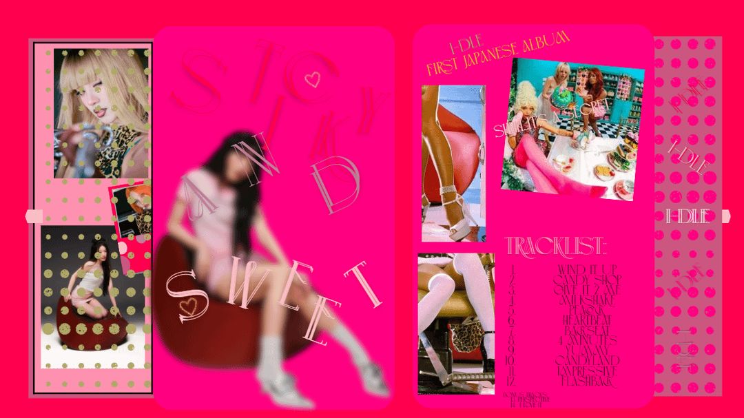
I named this album Sticky and Sweet because tracks Peacock and Milkshake bring on that raunchy and explicit feel, but the use of sweet candy throughout the songs and the themes behind tracks Wind It Up, Yummy and Bubble Pop Electric force out the side of uniqueness, personality and eccentricity. Sticky and Sweet.
Slides two and three: Album design
- To be honest I didn’t know what I wanted to do with the design of the album and I had no skills to do it, so I have created a front (left) and back (right) mock-up of the album that utilizes bold colours specifically pink which provides the perfect balance of what I imagine to be Sticky and Sweet.
- I have Minnie (slide two) and Soyeon (slide three) blurred out on the cover of the album. It provides a great contrast. On one hand you get the strategic colours, shade of pinks, polka dots, font and imagery that leaves a stinging craving for sugar while the blurred member on the cover provokes uncertainty you don’t know the facial expression the members are making so your only choice is to play the album and listen to their perspectives, thoughts and opinions within the songs.
by Latata_
2 Comments
>a debut Japanese album
But, they kinda already debuted in Japan, and had 2 EPs in 2019 & 2020 featuring remakes with a couple of original songs though.
Anyway, my main request is that the title track should not be a remake, and the main producer credits gets switched up going to Yuqi.
Ohh I love your idea! It sounds so interesting and I think they’d be able to pull it off successfully especially with the utilisation of electro sounds and autotuned vocals.
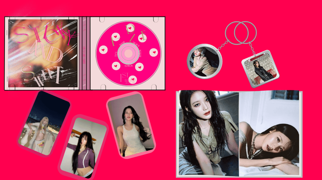
The pink background and the colour palette of the first image are on point and I especially like the vibrant poses. Something like this would definitely work. However, the photocards and keyrings don’t fit the vibrant, cotton-candy palette. They’re dark-toned, kind of noir-styled which clashes with the otherwise sugary vibe. Shuhua’s pose and outfit for example in the last picture leans more into dark and mature theme than the playful, bubblegum concept we want. (But it’s okay since you said the outfits would utilise pop colours). You could have also added a more diverse colour palette with bright yellows, baby blues and different shades of pink for the album. The tracklist is kind of unreadable with that thin, narrow font as well.
Other than that, I loved your idea!