Edit: downvote as much as you want but I know JYPE can give them a better online cover than this
weknowleeknow12 on
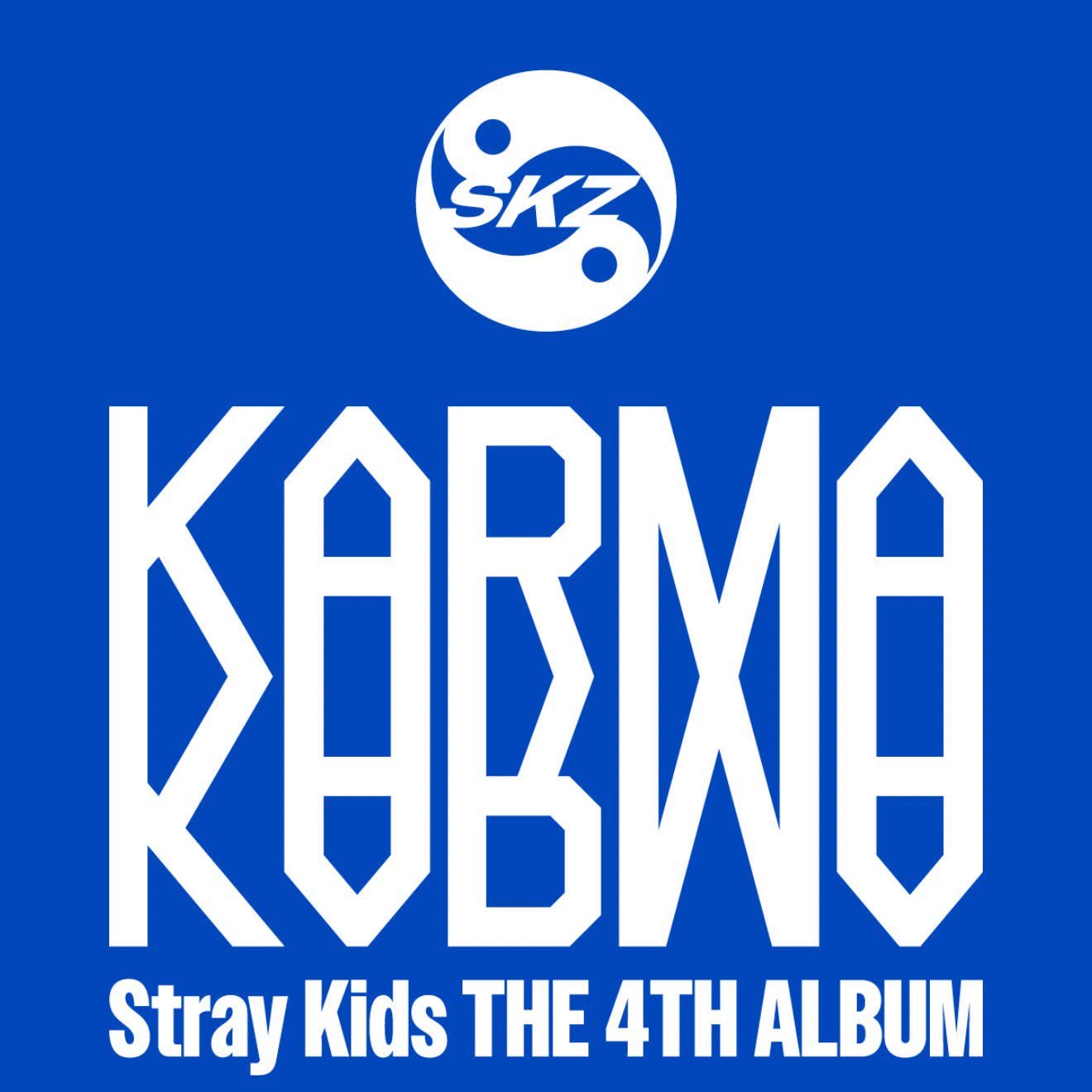
I’m excited for the album, but this cover was definitely…a choice
Chutneysandwich16 on
If I didn’t read the title I’d be sooo confused. Why the mental gymnastics with the typography? 😭
Legit read it as KOBMO at first 🥲
lucylivesherlife on
KOBXO
SetRacha on
Yeeahhh, I guess this is better than AI images, but I never get my hopes very high for SKZ album covers. Very high hopes for the album as a whole though!
elswheeler on
division 1 you will pay for your graphic design crimes soon
akibaranger on
it’s giving supermarket
celyurin on
whoever did this needs to be jailed 😭
Snoozyschmusie on
i actually quite like it! it’s giving corporate y2k
not_Hades365 on
Division 1 never put any effort into their creative design and it’s getting incredibly frustrating. Other group in the label get creative designs for their albums, even their juniors under the same management and skz gets this??? Despite being the best sellers?
maxxaronincheese on
This is giving me that absolutely cracked ass, busted ass NOEASY cover
Thunderous had such a beautiful and powerful concept and thAT’S what they used ? Love the group, but BABES
Edielu on
Graphic design is my passion
Wonkislay on
No offense but who though this is good idea or who lacked money to hire designer so did this on canva in 10 mins/j
ThisIsNotTokyo on
I thought it said KARINA
truvis on
Horrible colors
aardbeer on
I have to be honest. Whoever decided this should be the cover should go back to the drawing board.
This-Magician-1829 on
First glance I thought this was saying KARD , then I thought that this a PEPSI advertisement…
PLEASE SOMEONE FUND OUR HOMELESS ORPHANS HIRE A BETTER ALBUM COVER DESIGNER!!
Far-Squirrel5021 on
Why is it giving the logo of a math academy 😭 The bold plain blue is such a choice

18 Comments
I love them but they can’t be serious
Edit: downvote as much as you want but I know JYPE can give them a better online cover than this
I’m excited for the album, but this cover was definitely…a choice
If I didn’t read the title I’d be sooo confused. Why the mental gymnastics with the typography? 😭
Legit read it as KOBMO at first 🥲
KOBXO
Yeeahhh, I guess this is better than AI images, but I never get my hopes very high for SKZ album covers. Very high hopes for the album as a whole though!
division 1 you will pay for your graphic design crimes soon
it’s giving supermarket
whoever did this needs to be jailed 😭
i actually quite like it! it’s giving corporate y2k
Division 1 never put any effort into their creative design and it’s getting incredibly frustrating. Other group in the label get creative designs for their albums, even their juniors under the same management and skz gets this??? Despite being the best sellers?
This is giving me that absolutely cracked ass, busted ass NOEASY cover
Thunderous had such a beautiful and powerful concept and thAT’S what they used ? Love the group, but BABES
Graphic design is my passion
No offense but who though this is good idea or who lacked money to hire designer so did this on canva in 10 mins/j
I thought it said KARINA
Horrible colors
I have to be honest. Whoever decided this should be the cover should go back to the drawing board.
First glance I thought this was saying KARD , then I thought that this a PEPSI advertisement…
PLEASE SOMEONE FUND OUR HOMELESS ORPHANS HIRE A BETTER ALBUM COVER DESIGNER!!
Why is it giving the logo of a math academy 😭 The bold plain blue is such a choice