wow did pledis hire a new creative team? i’m loving how much more experimental and creative the concept photos for this comeback have been.
(the whitewashing can go though, please and thank you)
maiochiruhanabira__ on
i swear this concept and vibe really suits him !!! 😣
247with17 on
S.Coups… No please no. Don’t stare!
Hoshi with this hair and make-up reminds me of Kwon Jiyong (Gdragon). Please, you, too, stop being attractive.
AH! Please stop all this bias-wrecking/confusion!
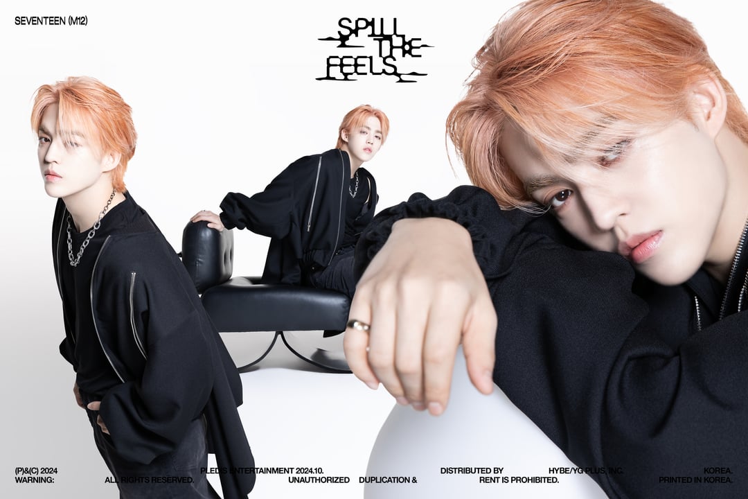
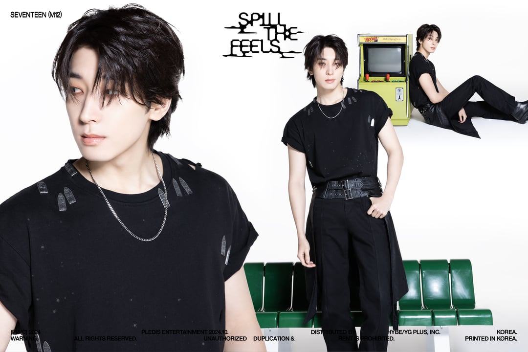
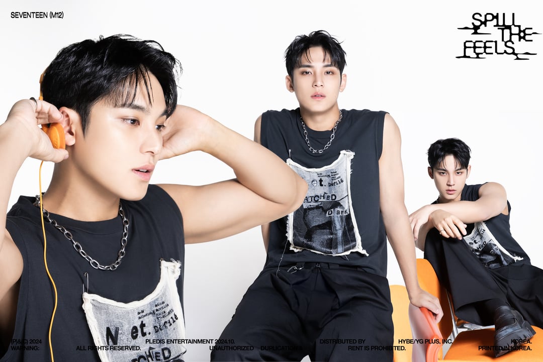
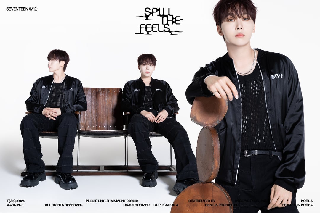
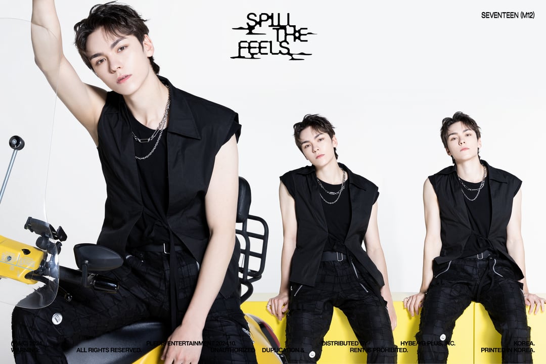
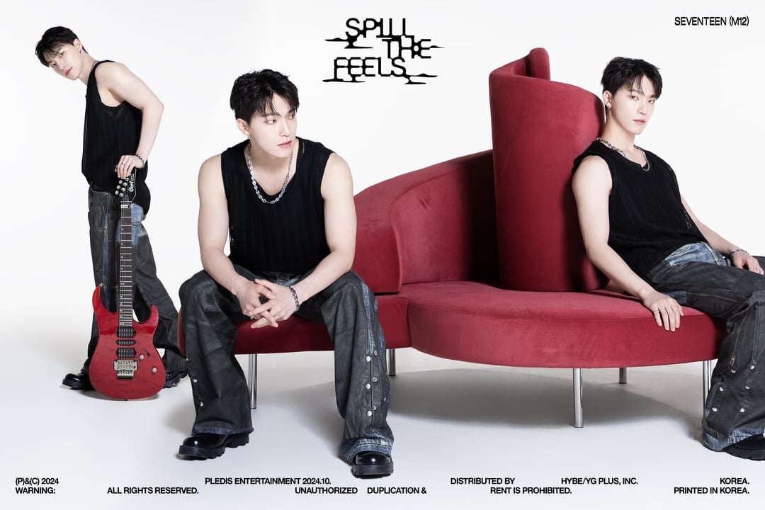
Loving this 3 pictures-poses in one teaser photo, however I’m certain they put only one photo per page in the Ver. 1 album photobook.
pothetellitubbie on
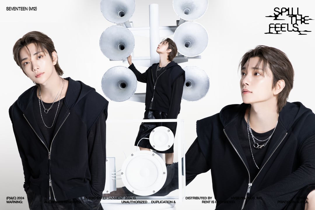
Welcome back Left and Right Mingyu!
ForgottenNoMore on
Man I love this format for concept pics.. Each of them feels like a character poster to movies
CoffeeNirvana on
Loving the simplicity with this version also love how technically it’s not too many pictures because sometimes they be giving away too much of the photo books.
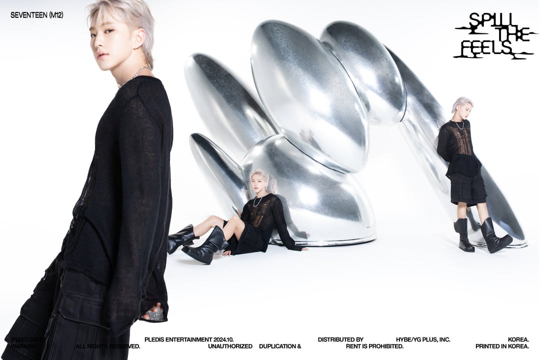
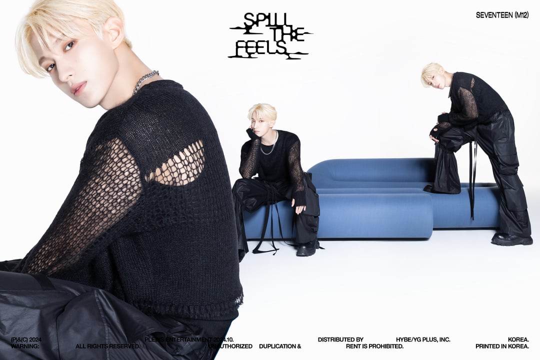
I like how the members are dressed in black but they have like a unique object with them and it really makes it all pop with the white background. Woozi kinda blending in with the background especially with the bleached hair 😭💀 A lot of whitewashing unfortunately but I think it’s extra noticeable because of the white background but nevertheless I think they done this concept really well so props for that with the different poses.
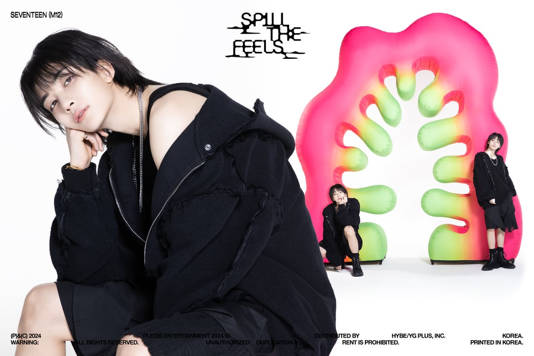
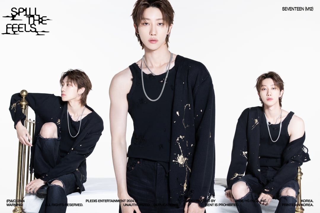
I may be biased but my favourite is Dino 😍 Our maknae rockstar, the sleeveless 🫠 but especially love the contrast of red with everything else! 💯
Edit: tbh I did expect some polarising opinions especially cause it’s a plain background again 😭 I mean yeah it ain’t their best but I do like how different it is to VER.0 and curious to see what the YOU version will look like, I still also think this is better than a lot of their previous concept photos but so far yeah VER.0 takes the cake.
Logical_Tension_2045 on
I’m gonna be a hater here sorry y’all
>! I bursted out laughing when I saw Scoups photo, like, this is ikeacore final boss, I literally prefer office seventeen over white background + random prop. They got my hopes up with ver 0 but this is so mediocre 😭.!<
Character_Bell_4144 on
Is it really a svt album if there’s no serving visuals against a white background and some random prop/furniture? Lmao I already saw it coming but I just can’t help but be disappointed every time their concept photos appear plain. And the fits? The clothes look familiar because I feel like they’ve been styled like that during Maestro promotions. This isn’t an attack to the boys but to plybe. It’s just upsetting especially when I see groups from smaller companies come up with something creative with their limited budget. WHERE IS THE BUDGET ALLOTTED TO? What’s the point of selling millions if you give us plain stuff over and over again? Their tight sched is not an excuse for their creative team to come up with something like this. Anyways, my boys are looking so good 🫶🏻 I still ordered the album but I’m not tempted to get the whole set.
justwannasaysmth on
no thoughts, only diarms (dino’s arms).
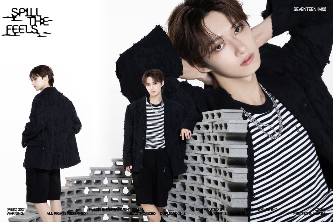
eta: i thought YJH was standing next to a slice of capsicum.
YogurtclosetNo7451 on
Why is the picture of Hani and Jun missing some body parts and white? What is this concept?😮😕
fxdxrxxn on
giving “high school yearbook” but im still into it
takemycardaway on
Death, taxes and white backgrounds for Seventeen ❤️
I thought that sculpture thing in Hoshi’s teaser was supposed to be a big hand horanghaeing and kept trying to figure out how it’s supposed to look like a tiger claw lol
GraphicToast on
The boys look sooo great as always, but why must we have yet another ikea concept photoshoot? My hopes were so high after the underwater concept photos, so I can’t help but feel a bit disappointed and underwhelmed with these photos. Free my boys from plain white backgrounds with random objects!!! Like why is Jun in front of concrete blocks and Hoshi has .. spoons in the background…? 😭
starlieyed on
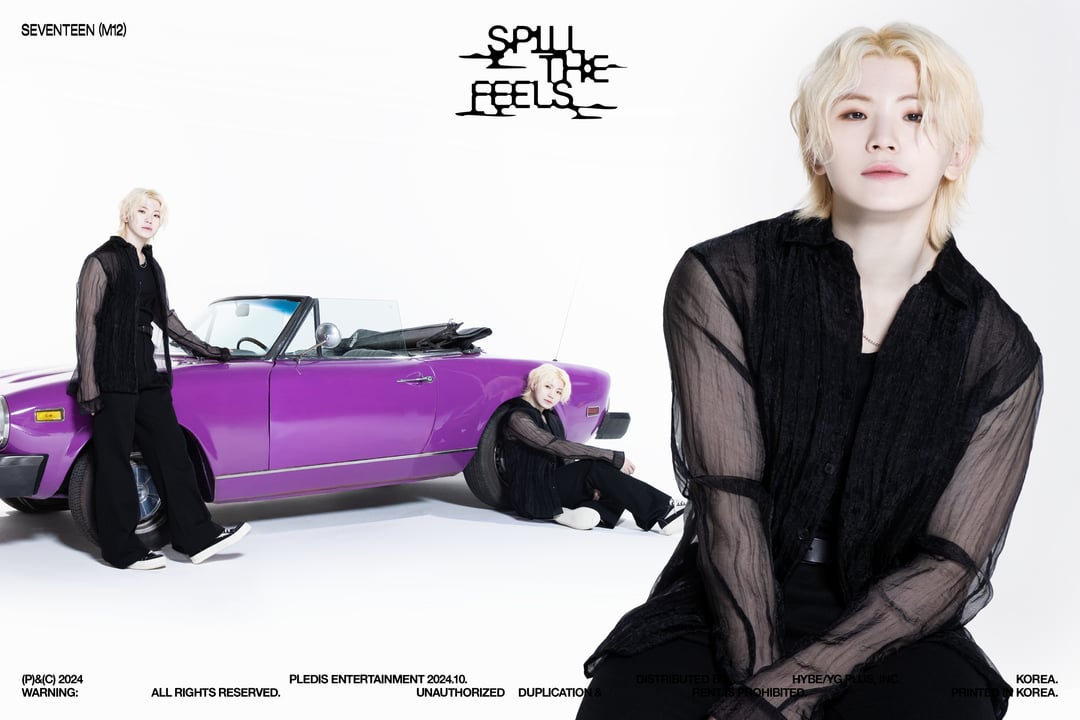
The way that all the hair colours suit them im very satisfied 😩😩😩😩😩 no more woozi bleached eyebrows thank the Lord
Weird_Site3169 on
All I’m gonna say is the “spill the feels” logo and how pledis chose to disrupt their photos by arranging the letters haphazardly piss me off. Feel New’s teaser doesn’t look half as bad on insta, like I’m not a big fan of over-simplistic style but I at least could see the visual direction they’re going for.
I like the 3-in-1 photo idea and the all-black fits but not feeling this random object setup lol… I def like the water pics best so far but I’ll be waiting to see ver. 3!

16 Comments
[Weverse link](https://weverse.io/seventeen/media/2-149594860)
wow did pledis hire a new creative team? i’m loving how much more experimental and creative the concept photos for this comeback have been.
(the whitewashing can go though, please and thank you)
i swear this concept and vibe really suits him !!! 😣
S.Coups… No please no. Don’t stare!
Hoshi with this hair and make-up reminds me of Kwon Jiyong (Gdragon). Please, you, too, stop being attractive.
AH! Please stop all this bias-wrecking/confusion!
Loving this 3 pictures-poses in one teaser photo, however I’m certain they put only one photo per page in the Ver. 1 album photobook.
Welcome back Left and Right Mingyu!
Man I love this format for concept pics.. Each of them feels like a character poster to movies
Loving the simplicity with this version also love how technically it’s not too many pictures because sometimes they be giving away too much of the photo books.
I like how the members are dressed in black but they have like a unique object with them and it really makes it all pop with the white background. Woozi kinda blending in with the background especially with the bleached hair 😭💀 A lot of whitewashing unfortunately but I think it’s extra noticeable because of the white background but nevertheless I think they done this concept really well so props for that with the different poses.
I may be biased but my favourite is Dino 😍 Our maknae rockstar, the sleeveless 🫠 but especially love the contrast of red with everything else! 💯
https://preview.redd.it/tt4udx5nndqd1.jpeg?width=1071&format=pjpg&auto=webp&s=e11b6f6b3c485216cbd3fa9200806a388e6c7790
Edit: tbh I did expect some polarising opinions especially cause it’s a plain background again 😭 I mean yeah it ain’t their best but I do like how different it is to VER.0 and curious to see what the YOU version will look like, I still also think this is better than a lot of their previous concept photos but so far yeah VER.0 takes the cake.
I’m gonna be a hater here sorry y’all
>! I bursted out laughing when I saw Scoups photo, like, this is ikeacore final boss, I literally prefer office seventeen over white background + random prop. They got my hopes up with ver 0 but this is so mediocre 😭.!<
Is it really a svt album if there’s no serving visuals against a white background and some random prop/furniture? Lmao I already saw it coming but I just can’t help but be disappointed every time their concept photos appear plain. And the fits? The clothes look familiar because I feel like they’ve been styled like that during Maestro promotions. This isn’t an attack to the boys but to plybe. It’s just upsetting especially when I see groups from smaller companies come up with something creative with their limited budget. WHERE IS THE BUDGET ALLOTTED TO? What’s the point of selling millions if you give us plain stuff over and over again? Their tight sched is not an excuse for their creative team to come up with something like this. Anyways, my boys are looking so good 🫶🏻 I still ordered the album but I’m not tempted to get the whole set.
no thoughts, only diarms (dino’s arms).
eta: i thought YJH was standing next to a slice of capsicum.
Why is the picture of Hani and Jun missing some body parts and white? What is this concept?😮😕
giving “high school yearbook” but im still into it
Death, taxes and white backgrounds for Seventeen ❤️
I thought that sculpture thing in Hoshi’s teaser was supposed to be a big hand horanghaeing and kept trying to figure out how it’s supposed to look like a tiger claw lol
The boys look sooo great as always, but why must we have yet another ikea concept photoshoot? My hopes were so high after the underwater concept photos, so I can’t help but feel a bit disappointed and underwhelmed with these photos. Free my boys from plain white backgrounds with random objects!!! Like why is Jun in front of concrete blocks and Hoshi has .. spoons in the background…? 😭
The way that all the hair colours suit them im very satisfied 😩😩😩😩😩 no more woozi bleached eyebrows thank the Lord
All I’m gonna say is the “spill the feels” logo and how pledis chose to disrupt their photos by arranging the letters haphazardly piss me off. Feel New’s teaser doesn’t look half as bad on insta, like I’m not a big fan of over-simplistic style but I at least could see the visual direction they’re going for.
https://preview.redd.it/fhjbp2vxsdqd1.jpeg?width=1241&format=pjpg&auto=webp&s=3801ff41e0f56592ab587377c95b860120f6fd64
I like the 3-in-1 photo idea and the all-black fits but not feeling this random object setup lol… I def like the water pics best so far but I’ll be waiting to see ver. 3!